Updated: Apr 27, 2025
Author: Tony Waldegrave
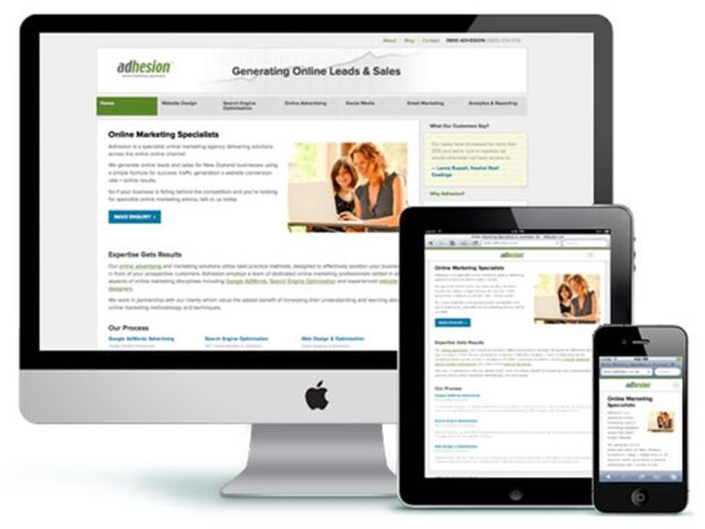
Responsive web design is the modern standard for building websites. Simply put, a responsive site automatically adjusts its layout and content to look and work its best no matter what device someone is using—whether it’s a mobile phone, tablet, laptop, or large desktop screen.
Test it yourself:
If you’re viewing our website on a desktop, try resizing your browser window. Watch as the layout shifts to fit perfectly at any width—no pinching, zooming, or awkward scrolling required.
Every year, more Kiwis browse the web on mobiles and tablets. Your customers expect fast, seamless experiences on every device. If your website isn’t easy to use on a phone, you’re likely losing visitors—and potential business.
Google have announced the following guidelines for responsive design as part of their ongoing commitment to accessibility.
Google recommends responsive design as best practice. Their official guidelines stress the importance of accessibility and user experience. If you want to perform well in Google Search and reach as many customers as possible, a responsive site is essential.
Adhesion has extensive experience building responsive websites for New Zealand businesses. Whether you’re happy with your current site or ready for a full redesign, we can help you:
Let’s make your website work on every device.
Contact Adhesion today for practical advice and a no-obligation chat about your mobile and responsive web design options.
Our reputation goes hand-in-hand with our team’s dedication to best practice. As a registered Premier Google Partner, our team refreshes our certifications every 12 months — A tradition we started over a decade ago. To stay ahead, we are always looking forward to upcoming certifications for online advertising, website development and search engine optimisation.
Blog • Terms • Privacy • 110 Mount Eden Rd, Mount Eden, Auckland 1024 • Mon–Fri 8:30am–5pm
© 2007-2025 Adhesion